
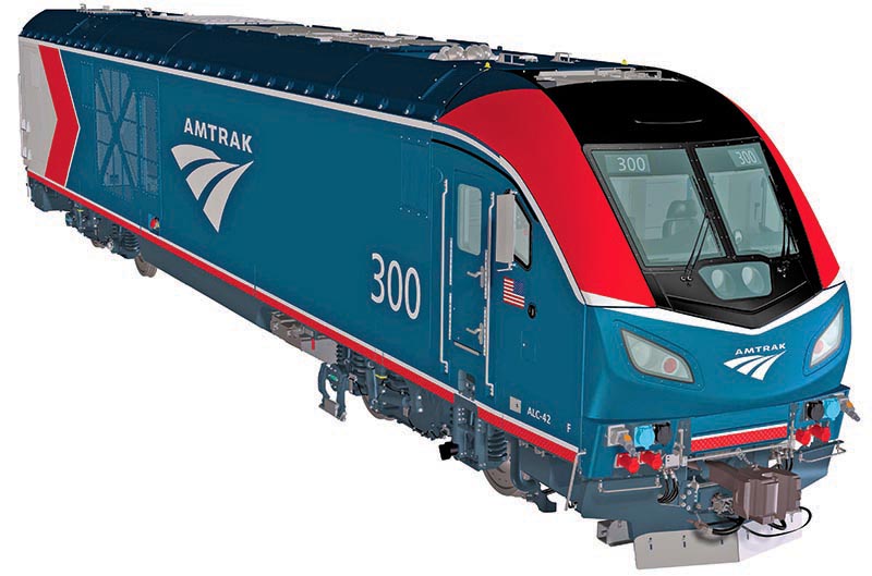
 In early August, Amtrak unveiled its new Phase VI paint scheme, its first new, non-commemorative design in almost 20 years. Shortly after the announcement, railfans began discussing the new design online. While most fans seemed to respond positively to the livery, there were a few doubters who questioned different decisions, or who thought they could do better.
This led me to wonder — just how do modern railways design new paint schemes? To find out, I reached out to Matt Donnelly, Amtrak’s lead brand communications specialist, and one of the team members behind the new Phase VI livery.
Starting the design of a new scheme was “very exciting,” Matt explained, noting that “this has been something that we wanted to tackle for a number of years.” Although Matt is a fan of several older liveries, and helped design the 2011 heritage schemes, he has long been dissatisfied with the numerous different designs carried by Amtrak equipment. In late 2018, when the carrier announced an order of new ALC-42 Charger locomotives from Siemens, Amtrak snapped at the chance to create a new scheme that looked forward, rather than back.
First, Amtrak worked with the builder to create a new, more elegant nose design, as well as make several subtle changes that improve maintenance. Simultaneously, Matt, along with a team of engineers and executives, produced more than 75 initial livery concepts. “I don’t recall ever working on a project where we’ve had that many options,” Matt recalled. The final design push came in a sudden rush at the end of 2019. “We only maybe had a couple months to finalize [the livery],” Matt added, since the team “only got the nose design [finished] in [the] fall.”
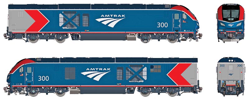
Artwork courtesy Amtrak
Several decisions went into creating Phase VI, all of which made the process more difficult. First, there was a need to stick with the existing Amtrak color palette, especially the blue that dominates in the new scheme. Second, the undercarriage had to remain dark gray, as Siemens did not stock any other color of replacement parts for those components. Since most Amtrak equipment is silver or stainless steel, it was necessary for the back end of the locomotive to match those colors. Add in several more complexities, such as safety and visibility regulations, the need to hide dirt in hard-to-clean areas, the desire for easy touch-up on commonly damaged components, and, not the least, carrying a recognizable brand identity for Amtrak, and the task that was before Matt and his team begins to seem nearly impossible. Oh, and did I mention that the left and right sides of Siemens’ locomotive bodies have different vent placements?
Phase VI is meant to be a “transitional” design. Next year, Amtrak will designate a builder for its new fleet of intercity passenger cars, and with them kick off the process for creating its new national image, which they are calling Phase VII. The Phase VI livery is meant to be a stepping stone toward that future, although, speaking as a fan here, my favorite aspect of the design is its subtle nod to the past. Toward the back of the locomotive, as a break between the blue body and the silver end, there’s a red splash that looks mighty familiar. Is it…?
“Yes,” Matt volunteered, anticipating the rest of my question. “The red chevron is a nod to the ‘motion mark,’” Amtrak’s first logo. If this is what today’s Amtrak can design as a transitional scheme, then I look forward with great anticipation to the development of a permanent livery in 2021.
—Consulting Editor ALEXANDER BENJAMIN CRAGHEAD is a transportation historian, photographer, artist, and author.